Just Enough CSS Grid to be dangerous
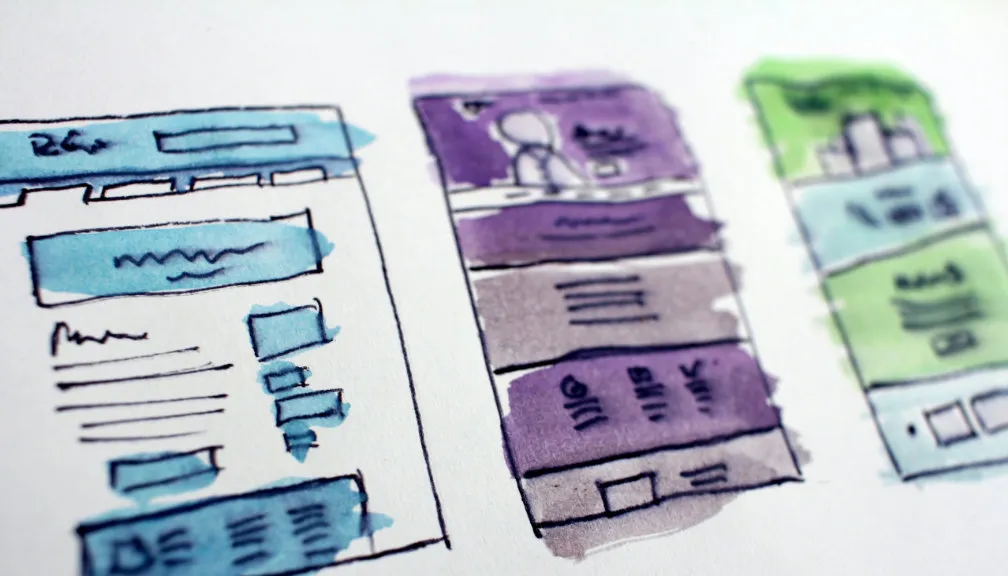
Photo by Hal Gatewood on Unsplash
CSS Grid is used to specify the layout, size, position of HTML elements on a webpage by dividing it into major regions; it allows you to specify your layouts in terms of both rows and columns on the page.
To properly understand the need for something like CSS Grid I think its important to examine where we have come from in terms of web layouts. First we started using <table> for layout which became problematic as soon as we had build responsive web pages to support viewing on both mobile and desktop. Next came Bootstrap and, more importantly, the 12-column grid which is used in a majority of component libraries to this day.
A key feature of the 12-column grid is being able to specify elements which would occupy a variable number of columns based on the screen size; something that just wasn’t easily possible with <table>. However this has also led to some rather messy HTML and “<div> hell”.
The example below uses the Complex Grid example from Material UI on the left and the same example recreated using CSS Grid on the right.
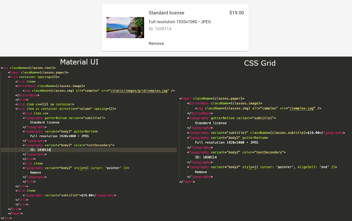
As you can see in the example, one of the real benefits of using CSS Grid is that it allows you produce much cleaner and more succinct HTML by removing some of the presentational elements from the HTML. Also by eliminating the 12-column grid we no longer force our content to conform to those columns making things such as a 5-column grid possible. One of the quotes that encapsulates CSS Grid in a great way is:
CSS Grid allows you to make HTML into what is was supposed to be. Markup of content. Not visuals, which belong in the CSS.
Reference: https://hackernoon.com/how-css-grid-beats-bootstrap-85d5881cf163
Using the Examples
There is a site available at https://cssgridexamples.netlify.com/.
On there you can see all of the following examples in action with live code updating so you can modify the components and see them update in real time.
Setting Up CSS Grid
To get started using CSS Grid, you simply need to use the display: grid; property. From there you are free to define your columns and/or rows. For example:
display: grid;
grid-template-columns: 1fr 5fr 1fr;
grid-template-rows: 1fr auto 1fr;
This will create a 3x3 grid; the 3 columns will be distributed such that the first takes up 1/7th of the available space, the next takes up 5/7ths and the last taking up another 1/7th. The first and third row will take up the same amount of space with the second row taking up as much space as it needs to fit the content.
It is also possible to mix units when defining your grid. For instance if we were to use the following columns:
grid-template-columns: 300px 3fr 1fr 20%;The first column would always be 300px, the second column will be 3 times larger than the third and the final column will always be 20% of the overall grid width.
repeat
This is a useful utility for when you are specifying multiple columns or rows each with the same properties. So instead of using grid-template-columns: 1fr 1fr 1fr 1fr; to define your 4 column layout, you can instead use grid-template-columns: repeat(4, 1fr);.
Spacing
You can define the spacing between rows and columns in your CSS Grid using grid-row-gap and grid-column-gap respectively. Alternatively, you can define the grid-gap property to define both the row gap and column gap in a single line.
Positioning Elements
There are two main CSS properties for positioning elements on the CSS Grid; the grid-column and grid-row for positioning based on column and row respectively. There is also a third called grid-area for specifying both column and row in a single property. You can specify positions for elements as follows:
grid-column: <start-column> / <end-column>;
grid-row: <start-row> / <end-row>;
grid-area: <start-row> / <start-column> / <end-row> / <end-column>;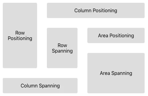
Consider the following examples:
grid-column: 2 / 5;- the element starts in column 2 and ends at column 5. Theend-columnis not inclusive so this element will only span 2 columns.grid-row: 1 / 4;- the element starts in row 1 and ends at row 4. Again, theend-rowis not inclusive so this element will only span 2 rows.grid-area: 2 / 3 / 2 / 5;- the element starts in row 2, column 3 and ends in row 2, column 5.
One of the more useful utilities for positioning elements is the span. Instead of specifying an end-column or end-row, you can instead specify a number of columns or rows than an element spans. Modifying the above examples to instead use span produces:
grid-column: 2 / span 2;grid-row: 1 / span 2;grid-area: 2 / 3 / span 1 / span 2;
Note that if an element doesn’t have any grid-column or grid-row property specified, it will be positioned in the next available area starting from the top-left and will span a single row and column.
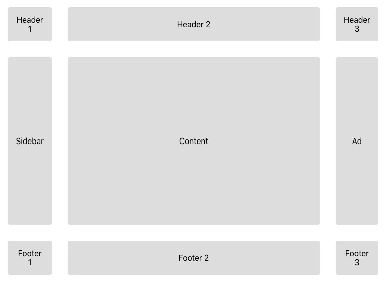
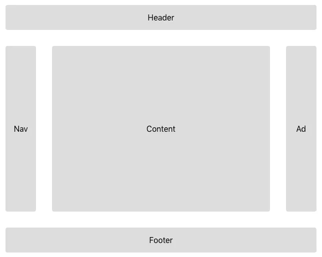
Named Areas
When defining your CSS Grid, it is also possible to specify named areas for each of the rows and columns on the grid. This allows you to specify a grid-area property on your elements which includes the corresponding name.
If I define a grid with the following properties:
display: grid;
grid-template-columns: 1fr 5fr 1fr;
grid-template-rows: 1fr auto 1fr;
grid-template-areas:
  "header header header"
  "nav content ad"
  "footer footer footer";
I can then define an element with the property grid-area: header; and it will be placed at column 1, row 1 and will span 3 columns. Similarly, I can define an element with the property grid-area: footer; and know that it will be placed at column 1, row 3 and also span 3 columns.
Aligning, Justifying and Placing
You can align, justify and place elements within the grid in exactly using align-items, justify-items and place-items respectively. Align is used for vertical alignment, justify is used for horizontal justification and place is used for specifying both vertical and horizontal in the single property.
They are used in the following ways:
align-items: start | end | center | stretch;justify-items: start | end | center | stretch;place-items: <align-items> <justify-items>;
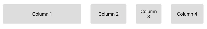
Responsive Utilities
While you will typically use @media queries for making your grids responsive; you can instead use the minmax() utility for defining a minimum and maximum width for each of your columns.
For example grid-template-columns: repeat(4, minmax(100px, 1fr)); will define a 4 column layout where all of the columns will be no less than 100px wide depending on the viewport width.
However the real power of the minmax() function isn’t really realised until we use it in conjunction with either the auto-fit or auto-fill keywords.
When you define your columns, instead of defining a number of columns, you can instead use of of these keywords to automatically adjust the number of columns depending on the column widths and viewport width.
The auto-fit keyword fits the currently available columns into the grid by expanding them so that they take all of the available space. Whereas the auto-fill keyword attempts to fill the row with as many columns as it can fit, regardless of whether they have been defined or not.
Given the column definition of grid-template-columns: repeat(auto-fit, minmax(200px, 1fr));, the layout will go from 1 to 2 columns when the viewport is 400px wide, 2 to 3 columns when it is 600px width and so on.
Browser Support
Browser support for CSS Grid is great if you don’t need to support IE 11 and even then it is supported using the -ms- prefix.
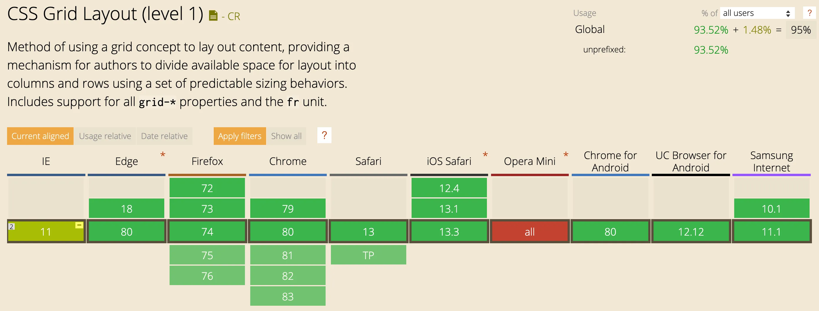
The browser devtools support is also fantastic, if you hover over the element which defines your CSS Grid in either Chrome or Firefox devtools, it will show you the grid you have defined.
Conclusion
We have looked into a number of ways for setting up and positioning elements using CSS Grid along with a brief look at the responsive utilities. If this all seems like a lot of information at once, I highly recommend you check out the example site https://cssgridexamples.netlify.com/ where you can play with each of the elements in this article.